
Color drives emotion, hierarchy, and clarity within a space, but the success of a palette rarely depends on the main hue alone. The undertone beneath that color can determine whether a room feels harmonious.
In contemporary design, where neutral palettes and natural finishes dominate, undertones play an even more critical role. They influence how stone and textiles interact with woodgrains, how paint reads against cabinetry, and how both natural and artificial light can shift a space from warm to cool without creating visual tension.
This article explores why undertones matter, how to identify them, and how Arborite’s collections are intentionally designed to support cohesive, undertone-aligned spaces. These nuanced undertones offer the flexibility to harmonize with a wide range of color palettes and enable seamless integration across different design environments and applications.
What Are Undertones and Why Do They Matter?
Every neutral contains an underlying pigment that subtly shifts its temperature:
-
beige may lean yellow, pink, or green
-
grey may hold blue, violet, or brown
-
white, cream, and eggshell can carry virtually any undertone—warm or cool—including hints of yellow, pink, blue, gray, green, or beige
A space succeeds when these undertones relate to one another. When they do not, even a perfectly executed design plan can appear off-balance.
Misaligned undertones often show up as:
-
wood tones clashing with worktop materials and flooring
-
cool stone surfaces next to warm colored tiles
-
cabinetry that feels “dusty” or “muddy” in certain lighting
Understanding undertones allows designers to build spaces that people want to spend time in, achieve their design goals and are warm and welcoming.
How Undertones Create Cohesive Interiors
1. Maintaining Temperature Harmony
Spaces are most comfortable when warm and cool elements are intentionally balanced. A warm walnut, a golden marble look, and a bronze accent work together because their undertones align, creating a cohesive family of warm or higher temperature hues rather than a scattered palette of competing signals.
2. Supporting Material Transitions
Modern interiors often mix textures: wood, metal, stone, upholstery. Matching undertones ensures these materials feel curated rather than assembled.
Practical Tips for Designers
1. Compare Neutrals Side-by-Side
Viewing two finishes at once reveals temperature shifts quickly. Use Arborite samples together to find the most cohesive combinations.
2. Analyze Lighting Conditions
Check how finishes look in the actual space throughout the day. North-facing rooms and strong artificial lighting can exaggerate undertones, so test samples under real conditions before finalizing selections.
3. Start With the Hardest Element
Countertops or work tops, flooring, or cabinetry often drive the palette. Choose the foundational material first, then select complementary laminates.
4. Contact your local rep
When you’re ready to refine your selections, your local representative is a valuable resource. They can guide you through options, help evaluate undertones in context, and provide practical insight to support confident, cohesive decisions from start to finish.
Where Arborite’s Collections Shine
Arborite’s collections are intentionally designed to make undertone coordination more versatile. Rather than forcing contrast, these surfaces help designers create balance across wood, stone, metal, and solid materials—especially in mixed-use or commercial interiors.
1. Woodgrains with Warmth and Clarity
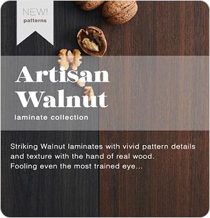
Finishes like Lakeshore White Oak and Artisan Walnut deliver warmth without leaning overly yellow or red. Their restrained undertones make them reliable anchors in spaces that use warm metals, leather, or natural textiles.
These woodgrains work particularly well when designers need visual warmth while maintaining a clean, contemporary feel—supporting palettes that include brushed brass, bronze, muted blacks, or soft whites without visual conflict.
2. Soft Neutrals with Depth
The Arborite Pure anti-fingerprint collection introduces light, desaturated neutrals that avoid flatness. These soft solids carry subtle undertone variation, and a smooth velvety finish which adds dimension while still reading calm and cohesive across large surface areas.
They are especially effective in hospitality, workplace, and healthcare-adjacent environments where designers want a residential sensibility without sacrificing durability or consistency. Their subtle undertones make it easy to coordinate with adjacent materials and finishes, creating a palette that feels approachable, modern, and intentionally restrained.
3. Stone Looks That Anchor a Palette
Clean veining and controlled base tones allow these surfaces to bridge warm and cool materials.
Arborite’s stone-inspired surfaces feature controlled contrast and balanced base tones, allowing them to sit comfortably between warm and cool elements. This makes them ideal as grounding surfaces like countertops, transaction desks, or feature walls, around which other materials can be layered.
Final Thoughts
Undertones are often overlooked because they operate quietly, but they determine whether a design feels purposeful or disjointed. For designers striving to create interiors with longevity and sophistication, understanding undertones is foundational.
Arborite’s collections make this easier. With finishes engineered for harmony and predictable color behavior, designers can build palettes that feel cohesive from concept through construction.
By paying attention to undertones, designers gain greater control, stronger material relationships, and a final space that feels intentionally crafted, not accidental.
See Undertones in Action with Real Samples
Understanding undertones is easier when you can compare materials directly. Arborite’s curated collections are designed to work together seamlessly, but seeing patterns side-by-side helps you build palettes with confidence and clarity.
Recent Articles
Categories
Alerts
Design inspiration, trend drops, new releases, and company updates delivered to your inbox.
The information below is required for social login
Sign In
Create New Account